As I prepare for Pull Out Day, I realized I really have to analyze where I am and what I have. While I definitely have enough material for me to survive on Pull Out Day, I realize that during Spring Break, I am going to be doing a lot of work. I have not met personal goals that I set in the beginning of the process, which is worrisome, yet can easily be fixed by putting in a lot of days during the Break. I still managed to look back and see what I had and what I was working with, which was surprisingly a great foundation. I have a few pictures I could use in my book which really show a couple of things: contrasts and emotion.
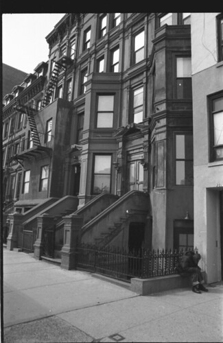
This is by far my favorite picture. This was taken right off of 125th, depicting these new beautiful apartments. In the corner, however, is an older black male who isn't quite letting go. He kept screaming things as people walked by, and while I couldn't understand him, he seems to be a usual to the area. People who walked by smiled, as if he was a familiar face in this area. In order to stay discrete and keep the validity of the image (in other words, make sure the image is raw, and not staged), the photo doesn't give a great view of the man's expression or facial details. This makes me think about what lenses I am using. The three I have at my disposal are a 28mm lens, 50mm lens, and a 135mm lens. The 135mm would give me a close up view of the man, but at the same time, I lose the entire background (buildings and architecture). If I use the 28mm, I get everything in one image, but lose details up close. I have to make decisions like this on the fly and ensure that everything I desire to be in the image is in there while still getting all the detail I could possibly fit in one picture.
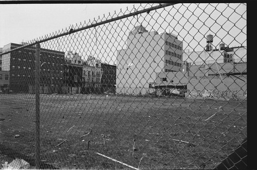
While this isn't an image that I would want in the final product, I like how this picture shows what Harlem is becoming. The background shows new buildings, while the graffiti covered ones are fenced off, preparing for demolition, and another brand new building will rise. A struggle in this picture was composing it well enough to see the barren ground that now is there while still getting the buildings in the background. Also, I didn't want the fence to be a distraction, but I wanted the viewer to see that it was there. While this photo was difficult to compose, I was still happy with the end result, but don't think that it has the quality or the meaning to really go into the final book.
This picture is the final one from 125th that I really liked. It really showed the true essence of my project, which is change. While on others I felt as if underexposure (meaning the picture is darker) served the image well, I don't think underexposure in this picture made it any better. I might bump the contrast up in photoshop and mess around there to get the look I want. The images message, however, is the exact one I was hoping to depict to the focus panel.
*NOTE: images are cut off (width). Click on the images for the full pictures*


Yahhhh dude!
ReplyDeleteThese are looking great. I can't tell if I had a dream that you said no one was commenting on your blog or if you actually said it, but here I am. I agree that that first one totally fits what you were going out to expose in the first place.
Glad to see you developing shit, can't wait to see more!
Cooper - Have you managed to get any interviews done over break? I am looking forward to seeing more of your work and hearing about your progress. See you Monday!
ReplyDeleteMs. Angney, I have had a couple of informal interviews (just to get my feet wet), but I have two formal interviews scheduled for next week. One with an older Harlemite who has lived there all his life and likes gentrification, and a librarian at the Schomburg Center for Research
ReplyDeleteSounds good! I can't wait to hear how they go!
ReplyDelete